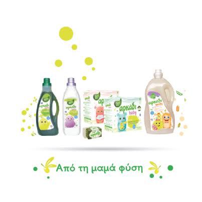
Pure products without synthetics, additives and fragrances. Biodegradable detergents with intense environmental consciousness, tested and hypo-allergenic so that every Greek family can trust them without any doubt.
This is why Arkadi is changing its image with a new logo, packaging and communication, in order to express its values even more clearly today. Its purity, environmental consciousness, its love for taking care of the whole family, and its Greek-ness, an integral part of its DNA.
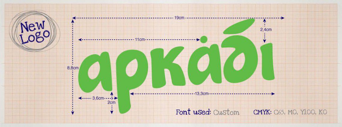
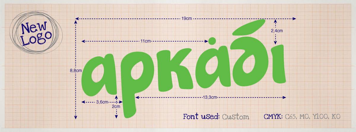
The new Arkadi logo expresses completely this renewal effort. What are its main features?
- The bright green color reflects the brand’s commitment to nature, the environment and the raw materials we use to make our natural products.
- The irregular tailor made font highlights the friendliness and purity of a modern Greek brand that knows how to adapt to today’s needs
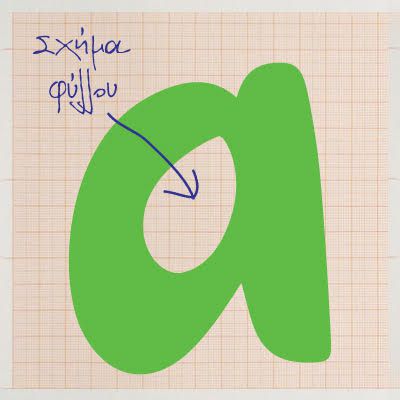
- The leaf enclosed in the letters represents the olive leaf that gives us the chlorophyll from which the green soap gets its color.

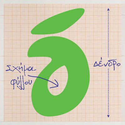
- The -d- that is a tribute to this gift of Greek nature called olive tree
The new logo is just the beginning of the effort that marries the “yesterday” of tradition with the brand’s “today”. Following, here is the new generation of Arkadi products that embrace the needs of the whole family, with the same love and dedication, through innovation and a 70 years tradition.